Why do people leave your booking page without booking?
Eugen Esanu, Founder of TimiTomi4 min read
The short answer
People leave a booking page when it has no photos, too much text or too many choices. Give every class a photo, keep descriptions short, and offer four choices at most. Our own booking page was only text at first. Here is what we changed, and why.
Give every class a photo
Our booking page was only text at first: a time, a class name and an instructor. We tested many versions of it, with customers and inside our team. The version that worked best had three things for every class: a clear name, one short sentence and a good photo.
The photo does the most work. People want to see the instructor, the energy and the people in the class. A new customer understands what a class is before they read a word. Regulars use the photos too: they remember a class by its picture, so they find it faster.
Tuesday
 07:30StrengthLift with a coach in a small group.
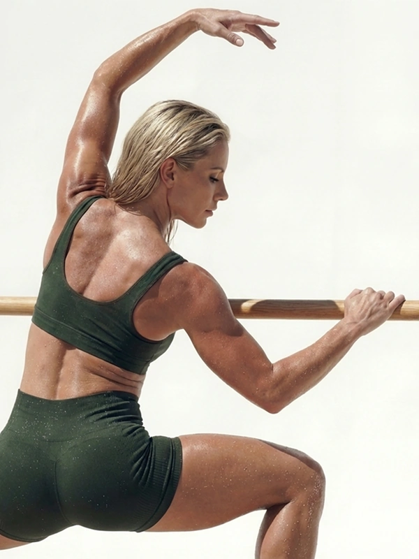 12:15BarreSmall, slow moves for strong legs.
 18:30BoxingLearn to punch well, with a partner.
About 20% more clicks at our studio
This number comes from our own tests, on a schedule with a few classes a day. If you run many classes a day, read When this is not right for you before you change anything.
Use simple photos
In the schedule, people scan the photos quickly. So each photo should show one simple idea, with few details:
- An instructor with a dumbbell for a strength class.
- Someone at the barre for a barre class.
- A pair of boxing gloves for a boxing class.
A photo with many people and many details is hard to read at that small size. A simple photo tells people what the class is.
When someone opens a class, show the real class. Add more photos there: the instructor helping people, and people working out. Between 4 and 8 photos is enough. On our own page, people rarely scrolled past the eighth photo, so more photos add nothing.
Keep the description short
Write two descriptions for every class:
- One sentence in the schedule. Its only job is to make people want to open the class.
- Two short paragraphs on the class page, of about three sentences each, at most. Say what happens in the class and who it is for.
A long description does not help people decide. It makes them tired, and fewer of them book.
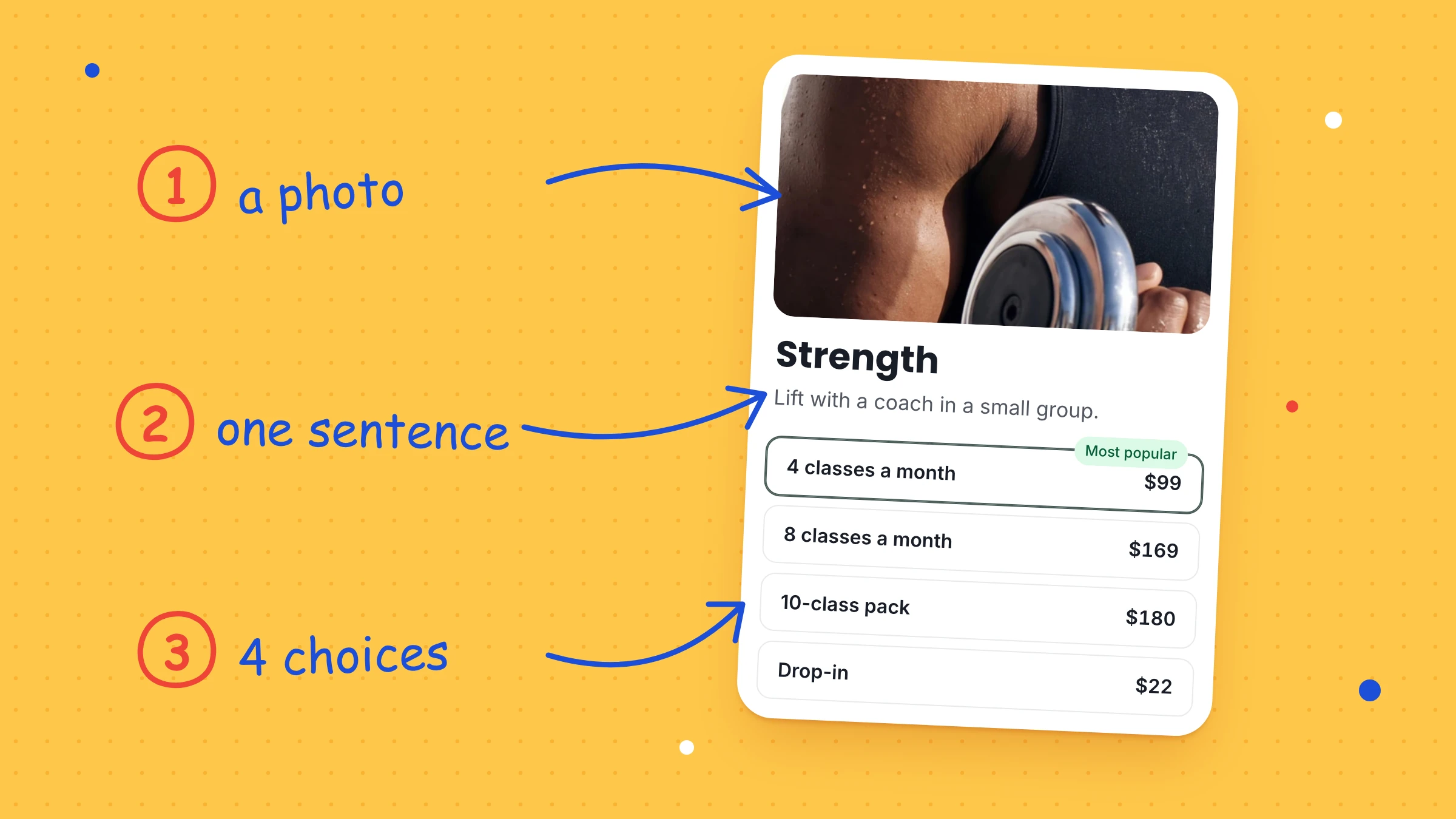
Strength
Lift with a coach in a small group. Every level is welcome.
RefundsLate cancellationsNo-show feesBookRules moved to the FAQ and terms
People have to stay focused on the Book button. Everything on the class page should help them get to it.
Put your rules in the FAQ and terms
Do not put refund rules and other policies in a class description. Customers need them, but not at the moment they decide to book. Give them their own place:
- An FAQ for the questions most customers ask, like how refunds work or what happens when they are late.
- Your terms, which every customer accepts when they buy.
Some customers will say they never saw a rule. A long description does not protect you from that. Terms they accepted when they paid, with a record of the date, do.
Offer four choices at most
When people choose between class packs and memberships, too many options stop them. They do not know what to choose, so they choose nothing and leave.
Show four options at most. Put the one you want most people to buy at the top. On a phone, the top of the list is the first thing people see.
Mark one option as most popular
A "Most popular" badge helps the customer who cannot decide. People trust what other people choose, so many of them take the option with the badge. At our studio, the badge usually brings 5% to 10% more clicks on that option.
It works best on class packs and memberships, where people compare prices. Put it on the option that suits most of your customers and works best for your studio.
Use "Most popular" only when it is true. If that option is not your most popular one yet, call it "Recommended".
When this is not right for you
- You run 20 or more classes a day. Then most people come to find a time, not to discover a class, and photos can slow them down. Our 20% came from a schedule with fewer classes. Test your page with photos and without them, and keep what gets more bookings.
- Your booking page has no FAQ and no terms. Then a short line about refunds in the class description is better than nothing. Keep it to one sentence, and add an FAQ when you can.
Your booking page in TimiTomi
In TimiTomi, every class has its own photo and description, and your booking page has a place for the questions people ask before they book. You can mark a class pack or a membership as Most popular. If you run many classes a day, one switch hides the class photos.
On every plan, customers accept your terms when they buy, and TimiTomi keeps a record of who accepted which version, and when.